Responsive TwentyTen: Fluid Layout for All Devices
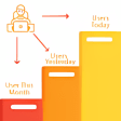
Responsive TwentyTen is a WordPress utility tool designed to enhance the TwentyTen theme by providing a responsive and fluid layout. This program is ideal for users who want their websites to display optimally across various devices, including smartphones like iPhones and Android devices, as well as tablets such as iPads. By utilizing CSS and media queries, Responsive TwentyTen ensures that the site adapts seamlessly to different screen sizes.
With its focus on user experience and accessibility, this free tool allows website owners to maintain a consistent and visually appealing design regardless of the device used. The implementation of responsive design principles makes it easier for visitors to navigate and interact with the site, ultimately improving engagement and usability. Responsive TwentyTen is a valuable addition for anyone looking to modernize their WordPress site.